Building a photo gallery has been a tough nut to crack for so many years. Throughout my career, I've used <table> layouts, <div>s with brittle margins and set widths, and tried my hand at flexbox. While all of these methods have worked, none of them felt like that silver bullet solution.
Then one day, the CSS gods bestowed upon us the magical power of CSS grids. Now, making a grid-based layout is an absolute delight. And, when we use grids with Tailwind CSS, we can create beautiful, functional UIs in a fraction of the time it used to take. So, let's hop right in and see how we can use them to make a photo gallery.
The Set-Up
We'll keep this project as small as we can, so we can focus on writing our CSS. First, we'll need an index.html file and a main.css file. We'll also need an img directory to store the images for our photo gallery. Inside of index.html, our boilerplate HTML can look like this:
<!DOCTYPE html>
<html lang="en">
<head>
    <meta charset="UTF-8">
    <title>Tailwind Grid</title>
    <link href="https://cdn.jsdelivr.net/npm/tailwindcss/dist/tailwind.min.css" rel="stylesheet">
    <link rel="stylesheet" href="main.css">
</head>
<body>

</body>
</html>
Pretty simple stuff. We have a basic HTML file that pulls in Tailwind via its CDN and references our CSS file as well.
Finally, we can head on over to Unsplash.com and grab some images for our gallery. Unsplash is a fantastic resource for all of your photo needs, and they also have a wonderful community. So, I highly recommend them for all of your projects.
When you find an image you like, just add it to your img directory. For this project, I recommend that you grab images that are on the taller side. Now let's write some code!
Our HTML
To start, we'll need a wrapper <div> inside of our <body> that can hold all of our grid elements.
<body>
    <div>

    </div>
</body>
Then, inside of here, we can add our first grid element.
<div>
    <a href="https://unsplash.com/photos/YTmgx_ru39U" target="_blank">

    </a>
</div>
As you can see, we're using an <a> tag so we can link to where we found our image. Inside of our <a> tag, let's add a title and the image itself.
<a href="https://unsplash.com/photos/YTmgx_ru39U" target="_blank">
    <h1>fox.</h1>
    <img src="/img/fox.jpg" alt="A photo of a fox">
</a>
And voila, we have our HTML. Now, let's duplicate this snippet for each of the images that we added and take a look at our final HTML.
<!DOCTYPE html>
<html lang="en">
<head>
    <meta charset="UTF-8">
    <title>Tailwind Grid</title>
    <link href="https://cdn.jsdelivr.net/npm/tailwindcss/dist/tailwind.min.css" rel="stylesheet">
    <link rel="stylesheet" href="main.css">
</head>
<body>
    <div>
        <a href="https://unsplash.com/photos/YTmgx_ru39U" target="_blank">
            <h1>fox.</h1>
            <img src="/img/fox.jpg" alt="A photo of a fox">
        </a>
        <a href="https://unsplash.com/photos/NKdZpTh5zY0" target="_blank">
            <h1>woman.</h1>
            <img src="/img/woman.jpg" alt="A photo of a woman">
        </a>
        <a href="https://unsplash.com/photos/TtybI0ORH7w" target="_blank">
            <h1>reeds.</h1>
            <img src="/img/reeds.jpg" alt="A photo of some reeds">
        </a>
        <a href="https://unsplash.com/photos/tV_1sC603zA" target="_blank">
            <h1>man.</h1>
            <img src="/img/man.jpg" alt="A photo of a man">
        </a>
        <a href="https://unsplash.com/photos/Ceuh97A6OYM" target="_blank">
            <h1>forest.</h1>
            <img src="/img/forest.jpg" alt="A photo of a forest">
        </a>
        <a href="https://unsplash.com/photos/mpw37yXc_WQ" target="_blank">
            <h1>bird.</h1>
            <img src="/img/bird.jpg" alt="A photo of a bird">
        </a>
    </div>
</body>
</html>
With our HTML in place, let's move on to our CSS Grid layout.
Layouts With CSS Grid
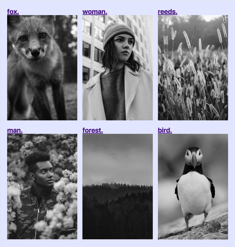
When we look at our HTML's output on the screen, we can see that we've got a lot of work todo.
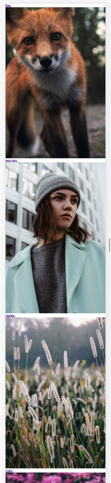
While we have some lovely pictures, they're just stacked right on top of each other. This layout may work for our mobile site, but for desktop screens, we're going to need to have two rows and three columns for our six images - sounds like the perfect job for a CSS grid.
At the time of this blog post, Tailwind doesn't have any utilities built for working with CSS Grids. But, I'm hopeful that'll change as grids become more prevalent. In the meantime, we can write some good old-fashioned CSS to set up our grid.
Let's get started by hopping into our HTML and adding a .grid class to our wrapper <div>. Now, inside of main.css we can define our grid.
.grid {
    display: grid;
    grid-template-columns: 1fr 1fr 1fr;
    grid-gap: 1.5rem;
}
If you haven't worked with CSS Grids yet, this can look a little overwhelming. But, let's go through it line-by-line.
First, we have display: grid. Just like with display: flex or display: table, we're giving this element specific instructions about how it should present itself and its children. In the grid's case, it's letting us define explicit "rules" for our elements to follow as they present themselves in a grid.
One of those rules is how to structure the columns, and grid-template-columns: 1fr 1fr 1fr covers that. This property is probably the newest, trickiest concept to grasp. All we're doing here is saying that we should have three equally-sized columns.
Each value we add to grid-template-columns defines an extra column. So, if we just wanted a two column layout, then we'd define that as ``grid-template-columns: 1fr 1fr`. Simple right?
Now, 1fr is a new value that lets us define the relative-sizing of our column. In our case, because each column is 1fr, then they'll all be the same width.
But, if we wanted our last column to be twice as wide as our first two columns, then we'd say grid-template-columns: 1fr 1fr 2fr. And just like that, we've told our last column to be twice as wide as our other two columns.
Finally, we have grid-gap: 1.5rem. This one is pretty simple. We're just saying that we'd like 1.5rems of spacing between each of the items in the grid. It's kind of like a special margin that we can apply to grid items to space them out perfectly.
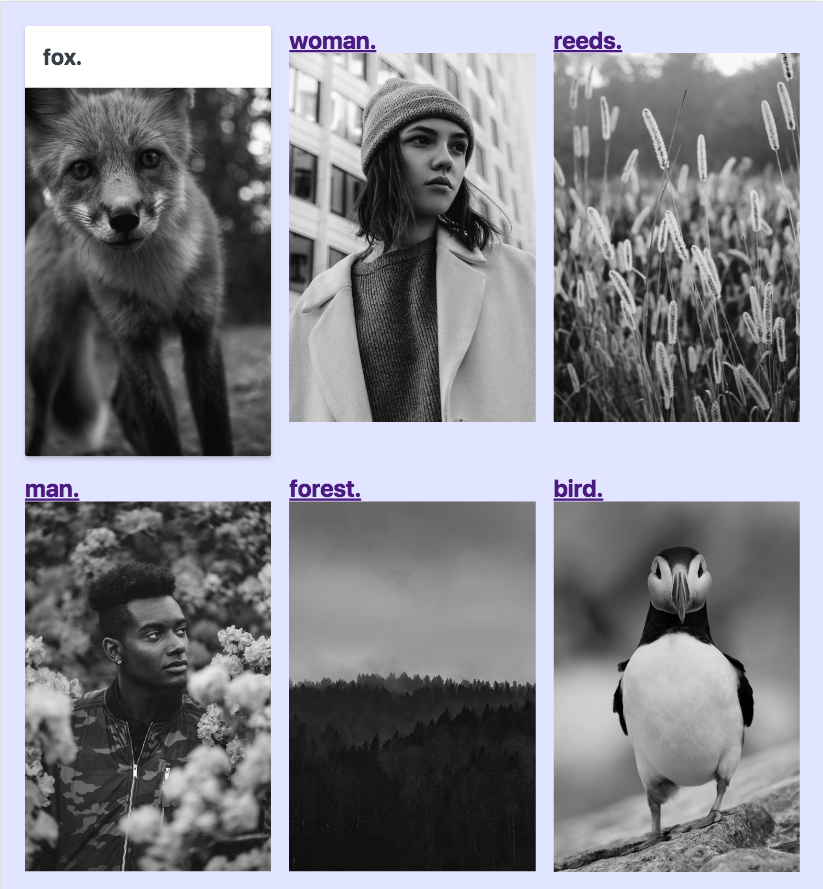
Our page now looks like this:
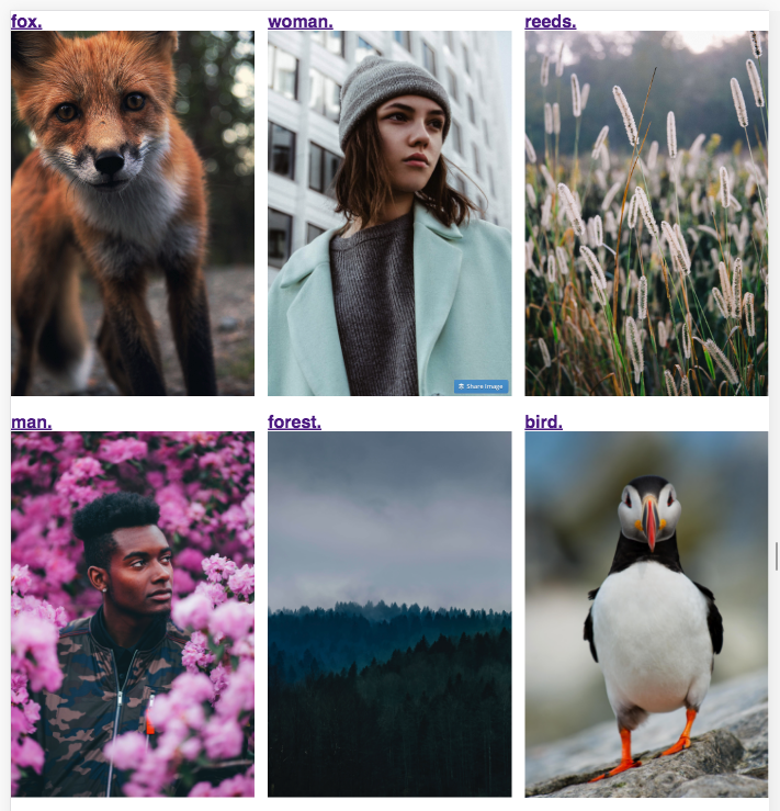
How cool is that? In three lines of CSS, we have a grid that would have taken us hours of wrangling to write in the past.
Mobile Layout
Now let's take a mobile-first approach and add some media queries to make our grid responsive.
.grid {
    display: grid;
    grid-template-columns: 1fr;
    grid-gap: 1.5rem;
}

@media screen and (min-width: 768px) {
    .grid {
        grid-template-columns: repeat(2, 1fr);
    }
}

@media screen and (min-width: 992px) {
    .grid {
        grid-template-columns: repeat(3, 1fr);
    }
}
As you can see, we've updated our original grid-template-columns to only have one column on mobile. Then when we reach tablets, we use the fancy repeat() helper to move up to two columns. Finally, on laptops, we're using the three column grid once again.
As a quick aside, repeat() simply lets us create a bunch of columns with way less work. Imagine if we wanted to use a twelve or sixteen column grid!
//Pretty annoying
.grid {
    grid-template-columns: 1fr 1fr 1fr 1fr 1fr 1fr 1fr 1fr 1fr 1fr 1fr 1fr;
}

//Absolutely delightful
.grid {
    grid-template-columns: repeat(12, 1fr);
}
I won't decide for you, but I know the way I'd prefer to write it.
With our grid taken care of, let's add a touch more custom CSS before we wrap this up with Tailwind.
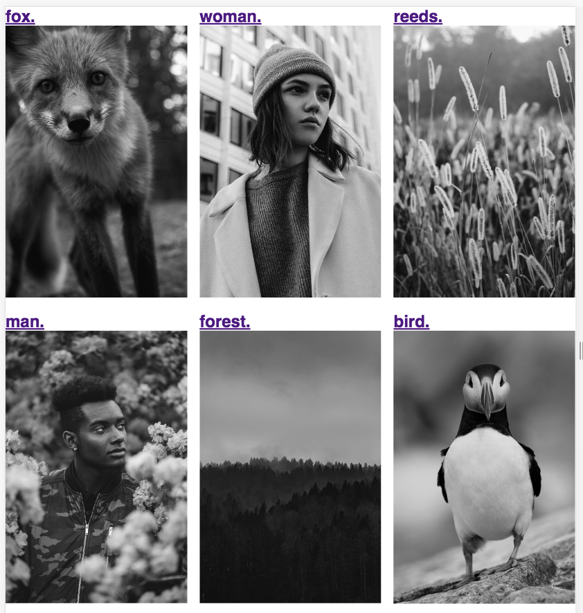
.grid a img {
    transition: all .2s ease-in;
    filter: grayscale(100%);
}

.grid a:hover img {
    filter: grayscale(0);
}
We're simply adding a transition and a grayscale filter to our images. Then on hover, we're revealing the full beauty of our images. I've found that this technique is excellent for bringing a level of consistency to a photo gallery while still preserving the uniqueness of each image within a delightful UX.
Now we're ready to style our images with Tailwind.
Styling With Tailwind CSS
Let's start by adding some color to our background, improving our typography, and increasing the whitespace.
<body class="bg-indigo-lightest font-sans">
    <div class="grid max-w-4xl mx-auto p-8">
       ...
    </div>
</body>
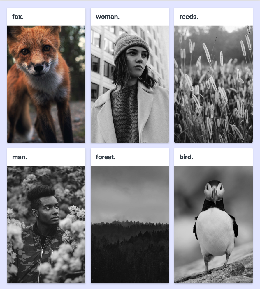
Right away the background color provides a better visual contrast between our elements, and the additional whitespace helps distinguish each of the cards.
Now we can style our first card before applying the styles to the rest of them.
<div class="grid max-w-4xl mx-auto p-8">
    <a href="https://unsplash.com/photos/YTmgx_ru39U" target="_blank" class="bg-white rounded h-full text-grey-darkest no-underline shadow-md">
        <h1 class="text-3xl p-6">fox.</h1>
        <img class="w-full block rounded-b" src="/img/fox.jpg" alt="A photo of a fox">
    </a>
    ...
</div>
Now we're classing up the place. Adding the white background and padding to our header helps elevate its weight on the page. While rounding the edges of the card and applying a shadow reinforces that the header is connected to its image.
At last, we're ready to finish our styling.
<!DOCTYPE html>
<html lang="en">
<head>
    <meta charset="UTF-8">
    <title>Tailwind Grid</title>
    <link href="https://cdn.jsdelivr.net/npm/tailwindcss/dist/tailwind.min.css" rel="stylesheet">
    <link rel="stylesheet" href="main.css">
</head>
<body class="bg-indigo-lightest font-sans">
    <div class="grid max-w-4xl mx-auto p-8">
        <a href="https://unsplash.com/photos/YTmgx_ru39U" target="_blank" class="bg-white rounded h-full text-grey-darkest no-underline shadow-md">
            <h1 class="text-3xl p-6">fox.</h1>
            <img class="w-full block rounded-b" src="/img/fox.jpg" alt="A photo of a fox">
        </a>
        <a href="https://unsplash.com/photos/NKdZpTh5zY0" target="_blank" class="bg-white rounded h-full text-grey-darkest no-underline shadow-md">
            <h1 class="text-3xl p-6">woman.</h1>
            <img class="w-full block rounded-b" src="/img/woman.jpg" alt="A photo of a woman">
        </a>
        <a href="https://unsplash.com/photos/TtybI0ORH7w" target="_blank" class="bg-white rounded h-full text-grey-darkest no-underline shadow-md">
            <h1 class="text-3xl p-6">reeds.</h1>
            <img class="w-full block rounded-b" src="/img/reeds.jpg" alt="A photo of some reeds">
        </a>
        <a href="https://unsplash.com/photos/tV_1sC603zA" target="_blank" class="bg-white rounded h-full text-grey-darkest no-underline shadow-md">
            <h1 class="text-3xl p-6">man.</h1>
            <img class="w-full block rounded-b" src="/img/man.jpg" alt="A photo of a man">
        </a>
        <a href="https://unsplash.com/photos/Ceuh97A6OYM" target="_blank" class="bg-white rounded h-full text-grey-darkest no-underline shadow-md">
            <h1 class="text-3xl p-6">forest.</h1>
            <img class="w-full block rounded-b" src="/img/forest.jpg" alt="A photo of a forest">
        </a>
        <a href="https://unsplash.com/photos/mpw37yXc_WQ" target="_blank" class="bg-white rounded h-full text-grey-darkest no-underline shadow-md">
            <h1 class="text-3xl p-6">bird.</h1>
            <img class="w-full block rounded-b" src="/img/bird.jpg" alt="A photo of a bird">
        </a>
    </div>
</body>
</html>
Bada bing bada boom, we've got ourselves a beautiful photo gallery and a better understanding of how to use CSS Grids with Tailwind CSS.
The Wrap-Up
We sure learned a lot today. Building our layout with CSS Grid exposed us to some of its newer concepts like grid-template-columns, grid-gap, and repeat(). And, using Tailwind to style the rest of our page increased our familiarity and understanding of the framework. Plus, we even covered a few design concepts to boot! As always, feel free to ask me any questions on Twitter. And until next time, happy coding!