As I've watch the Tailwind community explode over the last few weeks, one of the most frequent questions I've seen is: "how do I build XYZ component with Tailwind?" It's a legitimate question, but it kind of misses the point.
Tailwind isn't a collection of component recipies that we snap together to form an interface. Instead, it's more like the underlying ingredients that we can then use to create any component we want.
I'll admit that it takes some time getting used to that idea. But, a little practice can go a long way towards helping us wrap our minds around it. So, let's jump right in and see how we can use Tailwind to build a nav bar for ourselves.
The HTML
Before we do anything with styling, we need some HTML! Let's start with a simple little index.html file.

To get up and running quickly with Tailwind, let's just add it via its CDN.

Now, let's create a simple little nav bar for us to style. We'll start with a nav tag, and add two divs inside for the left and right side of our nav. Inside of the divs, we can add some a tags for our nav links.
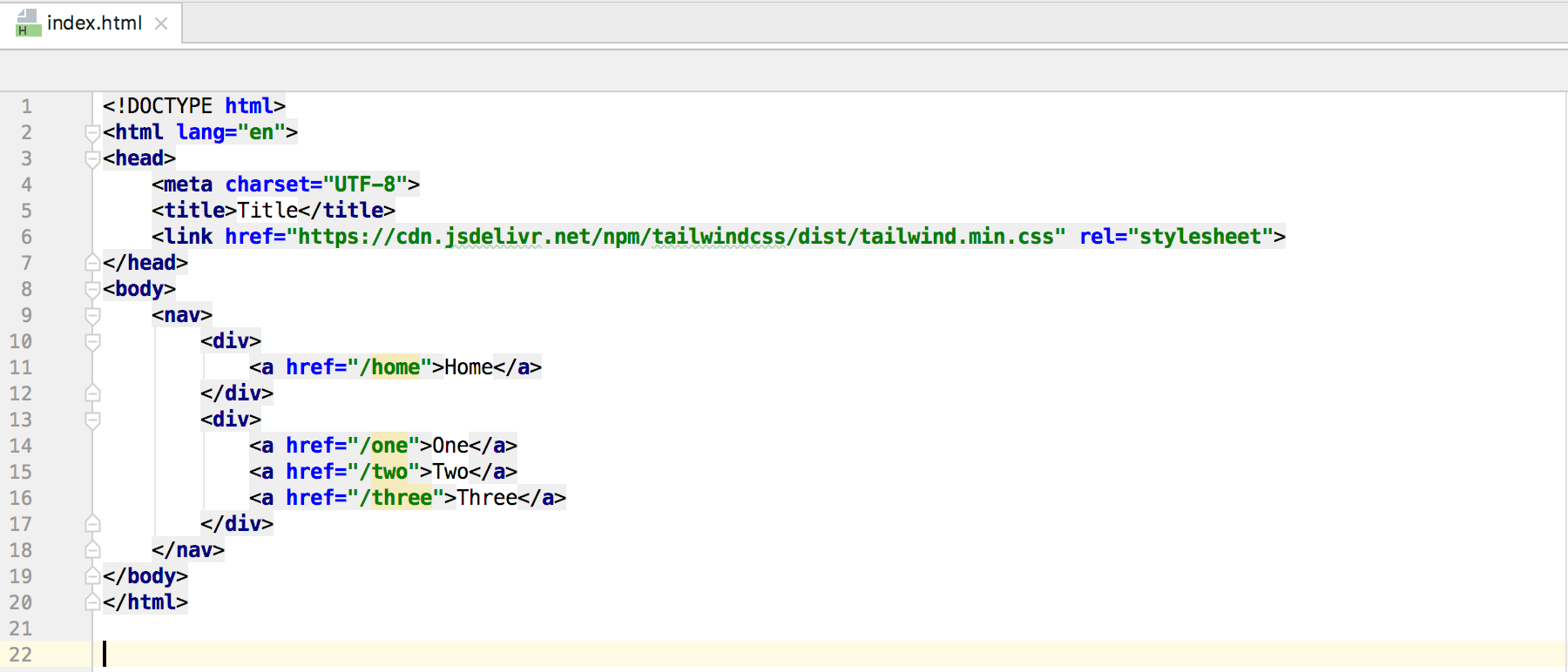
At the end of all this, we finally have some HTML on our page for us to style.

Flex That Nav
With our HTML ready to go, we can start adding some styles. Let's start with our positioning. On our nav tag, we can add .flex and .justify-between to get our divs into the right place.

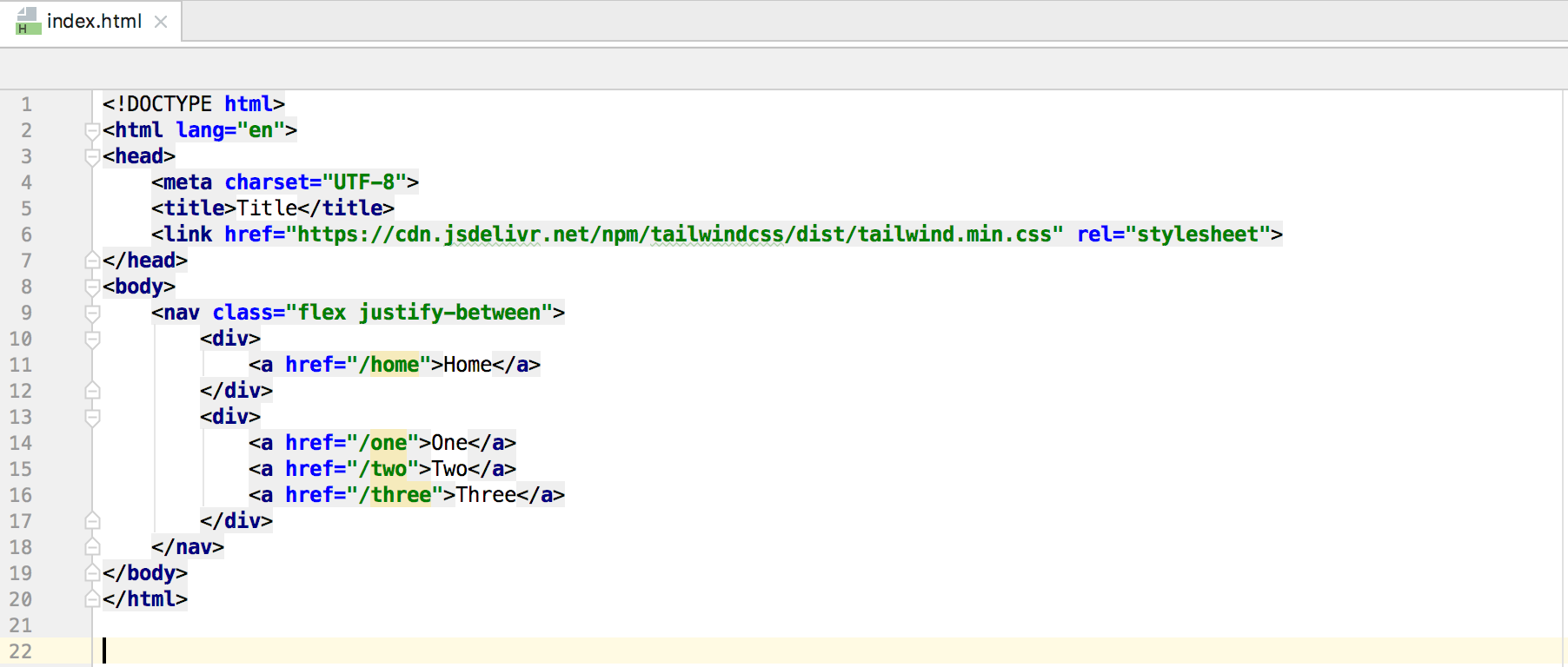
This looks pretty good on a laptop, but what about mobile?

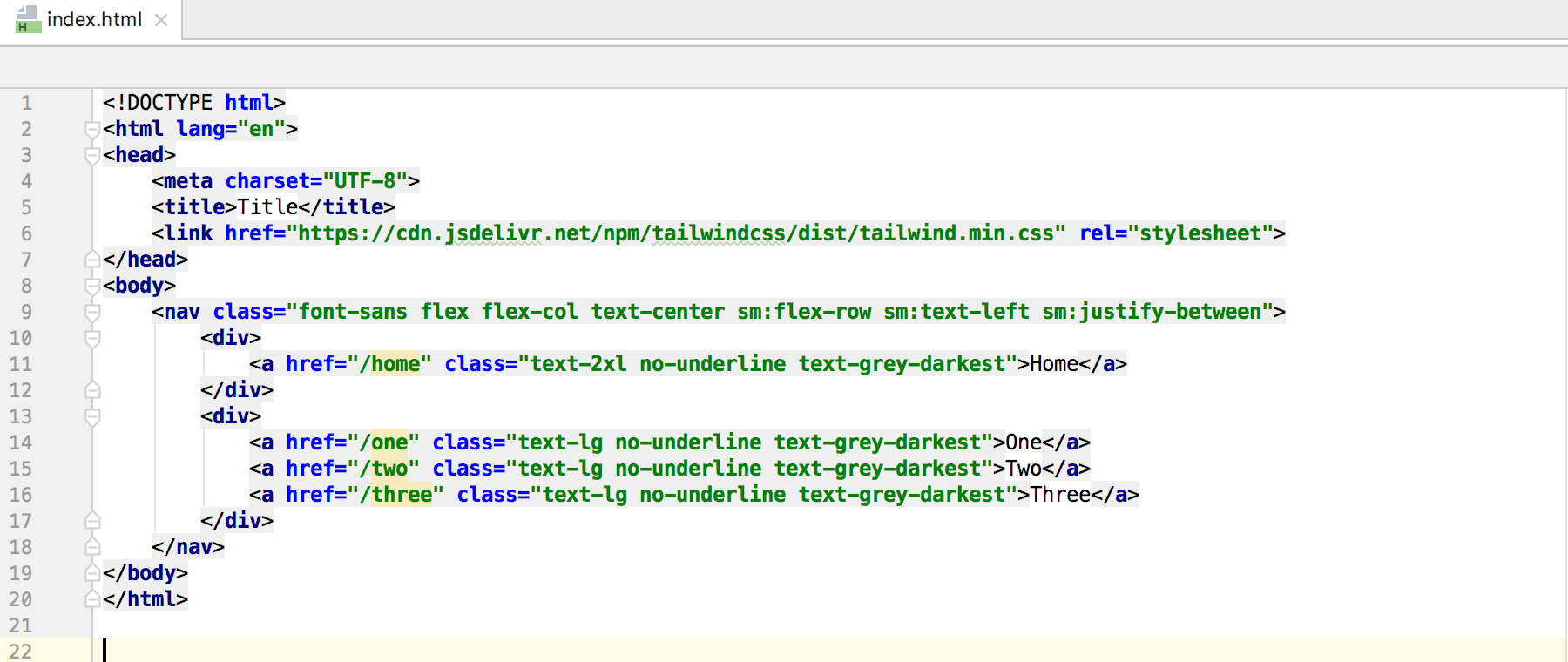
Hmm, it needs a little work. With Tailwind, we can easily make our styles responsive with a mobile-first approach and some very handy responsive prefixes. For our existing classes, we can add the sm prefix to .justify-between like so .sm:justify-between. Here, we're telling the nav to use .justify-between once we've reached the sm breakpoint.
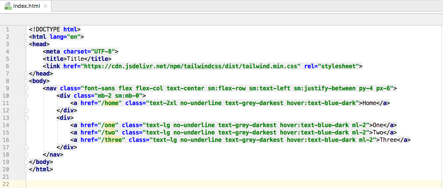
Now, we can add .flex-col, .text-center, .sm:flex-row, and .sm:text-left to our nav to round out our code. And volia! We have a responsive nav now.


Style's The Word
With our responsiveness down, let's make our nav links look a little nicer. We can add .text-2xl to our home link to make it stand out, and .text-lg to our other links. We can also get rid of the default underlines by adding .no-underline to all of the links. To make them look even less like a default link, we can add .text-grey-darkest to each of the links and add .font-sans to our nav.
Altogether, we now have some pretty good looking nav links.
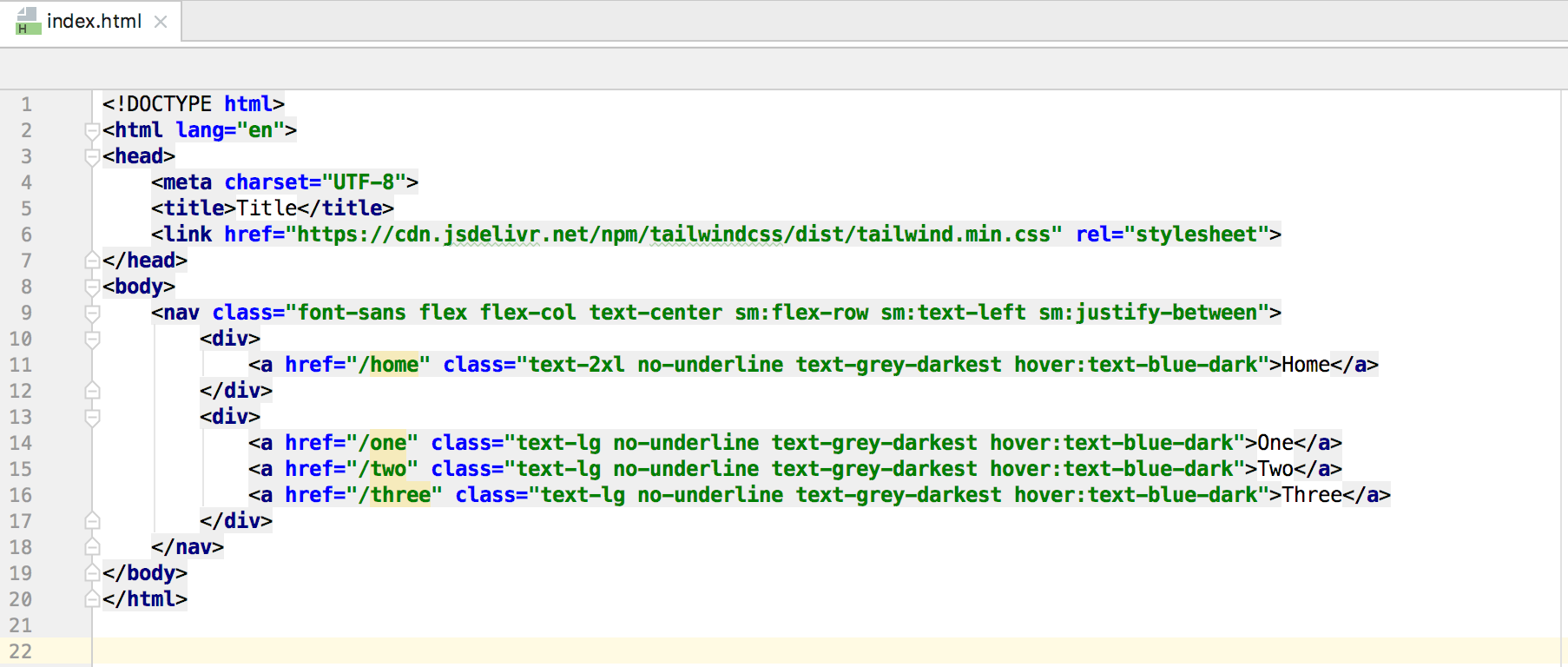
Now, these wouldn't really be good nav links if they didn't have a hover effect, right? Tailwind makes this super easy too - just add a hover: prefix to any class, and that class will be applied on hover. So, for our nav links we can add .hover:text-blue-dark to add a hover effect and a pop of color.

Spread It Out
Our nav is starting to feel a little cramped now, so let's add some spacing to give it some room. For each of the links on the right hand side, let's add .ml-2 to spread them out a bit. On our home link's parent div, we can add a .mb-2 and a .sm:mb-0 to add some spacing on mobile. Finally, to get everything away from the edges, we can add .py-4 and .px-6 to our nav tag.


Final Touches
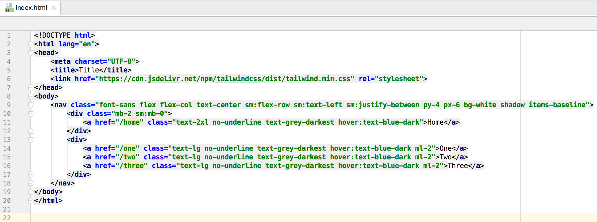
With our links looking good and our positioning all squared away, it's time for us to take this nav to the next level. To start, we'll add .bg-white and .shadow to the nav tag. Now, it's clear that our right side links are a little too high, so let's also add .sm:items-baseline to the nav tag to bring them back down. Bada bing, bada boom we've got ourselves a nav bar.


Wrapping Up
We just used a whole bunch Tailwind's utility classes to build a responsive nav without writing a single line of custom CSS. Unbelievable! Now, with that Tailwind behind you, feel free to clone this repo and customize this nav bar however you'd like. As always, if you have any questions feel free to ask me on Twitter. And until next time, happy coding!
